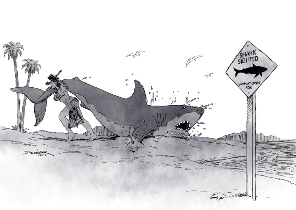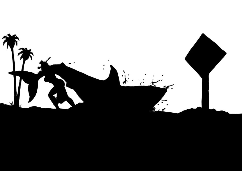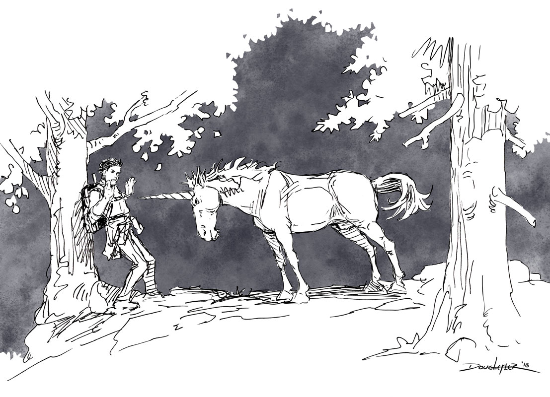
If I had one piece of advice to give artist who wanted to improve their drawing and composition, especially for the purposes of storytelling, it would be this: make your ideas read in silhouette.
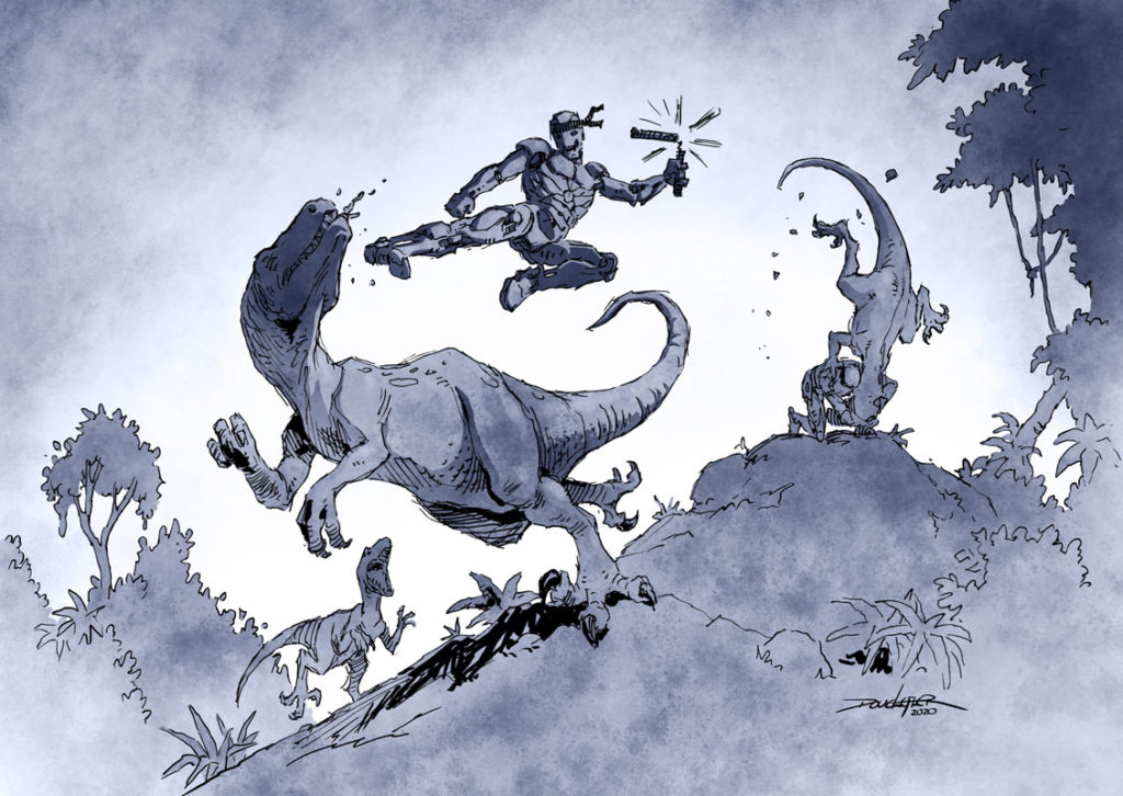
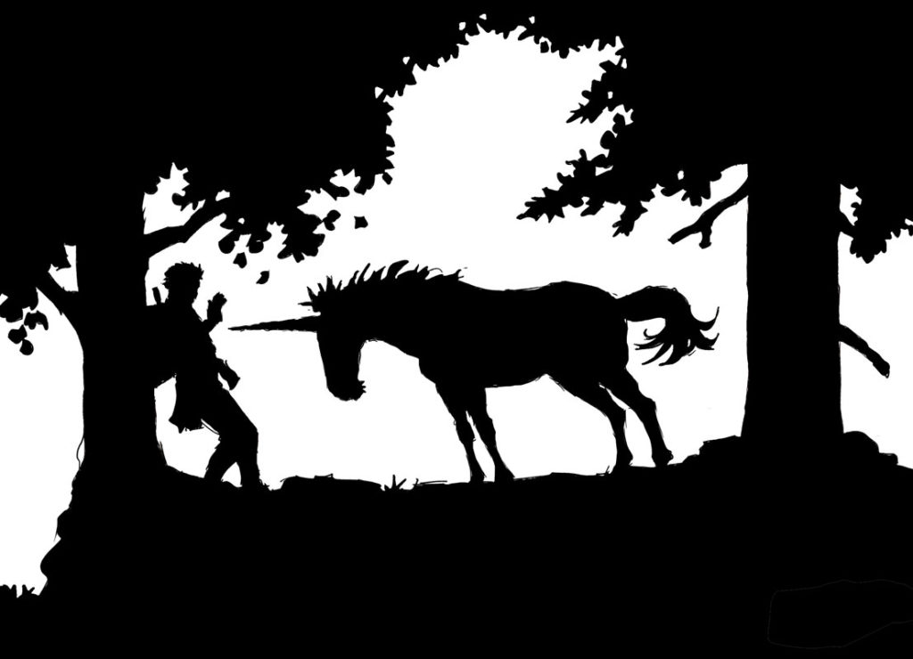
Some decades ago, when I got my first full time job I was working on the Disney animated film THE FOX AND THE HOUND. It was a great opportunity to learn, and the fact that I was getting paid at the same time convinced me that I had done something magnanimous in a past life. People like Eric Larson, Frank Thomas and Mel Shaw were tutoring me. All of us newbie animators were encouraged to flip our drawings on the light board and shade them on the back side to see if the poses would read in silhouette. This is because the human eye can perceive the outline of a form quicker than it can perceive the internal detail.
In my later career as a storyboard artist the practice of making compositions read in silhouette became ingrained; I think about it as I’m doing it any longer. The best drawing lessons are the ones that become second nature, and free you to concentrate on the ideas and the emotions that you are trying to convey.
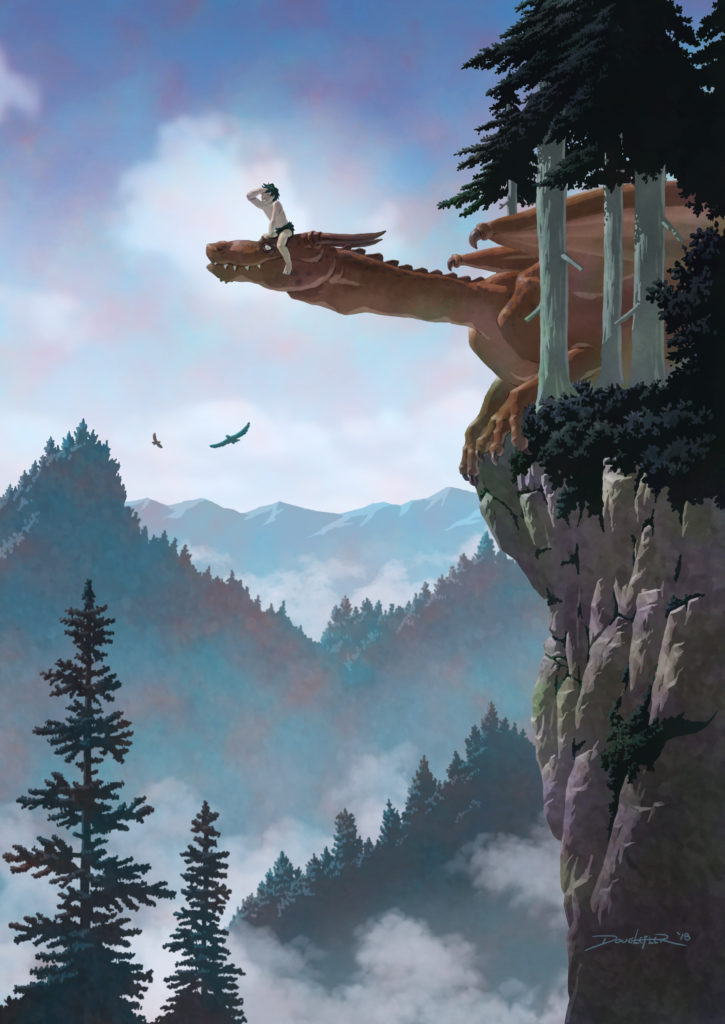
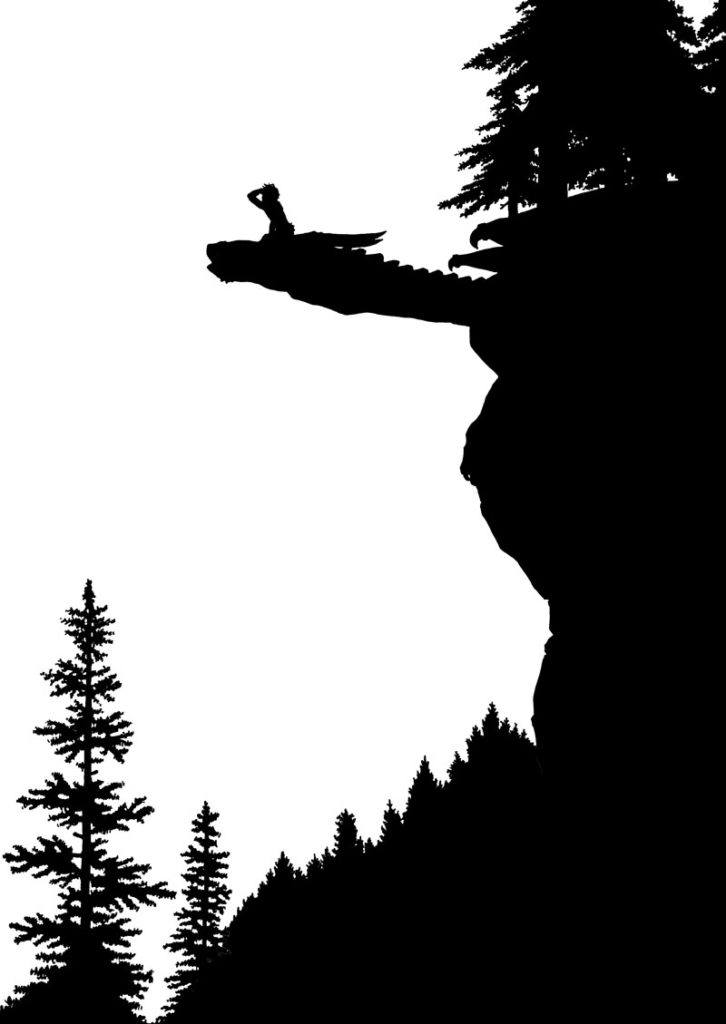
If you are working digitally it is easy to create a separate layer, outline the primary elements of your composition and fill them in with black to see how it reads. If you are working on paper and don’t have a light board, flip the drawing and hold it against a window (preferable during the day so sunlight can come through) and do a flat shading of the subject with the side of a pencil to make sure the outline of the form is communicating the story you want to tell.
Practice this and your drawing will improve.
